
The short answer: test the whole conversation
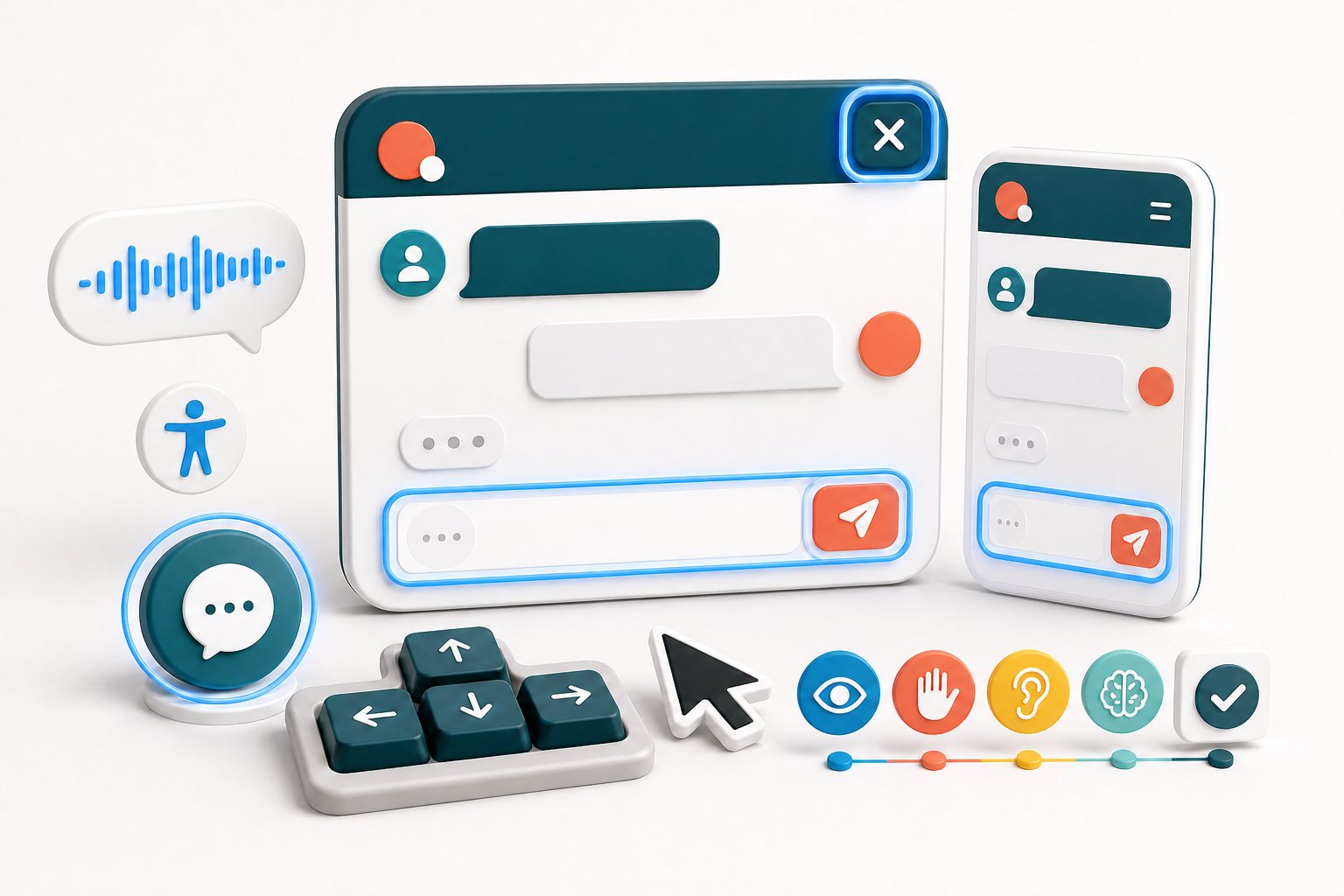
An accessible live chat lets people complete the same essential support task with a keyboard, touch screen, zoomed display, screen reader, or other assistive technology. That includes every state: the closed launcher, the open panel, message history, input controls, error feedback, new replies, offline message mode, and the close action.
Start with a real task instead of a visual inspection. Open a product or service page, launch the chat without a mouse, send a question, receive a reply, review the history, and close the panel. Repeat on a narrow mobile viewport and at increased browser zoom. Each failure points to a specific part of the experience that needs attention.
Accessibility is a shared outcome. The widget matters, but so do the WordPress theme, sticky banners, cookie notices, custom CSS, page-builder layers, and the words your team writes. A chat can work correctly in isolation and still become difficult to use when another site element covers it.
Start with the launcher and its page position
The launcher needs an accessible name that describes its action, such as opening customer support chat. An icon alone may look familiar to one visitor and remain ambiguous to another. The programmatic name also gives speech-input and screen-reader users a dependable way to identify the control.
Check the launcher on representative pages, not only the homepage. It should not cover navigation, consent controls, checkout fields, product options, booking buttons, or a back-to-top control. Open the site at common phone widths and rotate the device. Also test pages with unusually long menus, notices, or validation messages, because those states often expose collisions that a clean demo page does not.
Make the control forgiving to activate. WCAG 2.2's Target Size (Minimum) criterion uses a 24 by 24 CSS pixel target or sufficient spacing, with defined exceptions. A visibly larger launcher is usually easier for touch users, people with limited dexterity, and anyone using a phone while moving. Do not place a tiny launcher directly beside another small target.
Sources: W3C: Understanding Target Size (Minimum) · Yapdesk guide: Customize the chat widget
Complete the chat with a keyboard
Put the mouse aside and use Tab, Shift+Tab, Enter, Space, and Escape where appropriate. You should be able to reach the launcher, open the panel, move through every interactive control, enter a message, activate send, review any menu, and close the chat. WCAG 2.2 requires functionality to be operable through a keyboard interface unless the underlying task genuinely depends on a path-based movement.
Watch for keyboard traps. Focus must not become stuck inside the panel, but it also should not jump unpredictably into the page behind it. When the panel opens, the interaction should have a sensible starting point. When it closes, returning focus to the launcher helps the visitor continue from a known location.
Every focused control needs a visible indicator. Test against light and dark portions of the widget, and do not remove the browser outline unless an equally clear replacement exists. The focused item must also remain visible. W3C specifically notes that persistent user-opened content such as a chat window can obscure focused page controls and should be designed to avoid that problem.
Sources: W3C WCAG 2.2 · W3C: Understanding Focus Not Obscured
Use clear labels, instructions, and errors
A placeholder inside the message field is not a complete substitute for a label. Placeholders disappear as people type, can be difficult to see, and may not provide the dependable association that assistive technology needs. W3C's forms guidance recommends identifying controls with properly associated labels and giving users the instructions required to complete the form.
Keep the offline form short. Ask only for information required to answer the request, explain required formats before submission, and identify mandatory fields consistently. If the visitor makes an error, name the affected field, explain the correction in text, and preserve the information already entered.
A successful send also needs feedback. Show a concise confirmation that the message was received. In Message mode, add an honest expectation for follow-up. W3C notes that success messages confirm task completion, while clear error notifications help visitors understand and resolve problems. Color and an icon can support the message, but they should not be the only way meaning is conveyed.
Sources: W3C WAI Forms Tutorial · W3C WAI: Labeling Controls · W3C WAI: User Notifications
Make new chat messages perceivable
Chat changes while the visitor is using it. A typing state appears, a reply is appended, sending completes, or the connection status changes. A screen-reader user should not have to repeatedly search the panel to discover whether anything happened, and focus should not be pulled away from the message field every time a reply arrives.
W3C documents the ARIA log role as one technique for sequential updates such as a chat history. New additions can be announced by assistive technology without moving focus to the updated region. A status role can be useful for concise application states because it creates a polite live region. These are techniques, not magic attributes: structure, naming, announcement frequency, and browser-assistive-technology behavior still need testing.
Avoid announcing decorative events or the entire conversation after each update. That creates noise and can interrupt message composition. Test a normal exchange with a screen reader, including rapid replies and a failed send. The visitor should hear the useful change once, retain control of focus, and be able to review earlier messages in a logical reading order.
Sources: W3C: Using role=log for sequential updates · W3C: Using role=status for status messages
Check reflow, zoom, and the mobile keyboard
Open the chat at a narrow width and increase browser zoom. Text and controls should remain usable without losing content or requiring two-dimensional scrolling for ordinary reading. WCAG 2.2 includes requirements for text resizing and reflow, and its guidance warns that fixed or sticky content can make reading and keyboard focus difficult when the available viewport becomes small.
On a phone, tap the message field so the on-screen keyboard is visible. Confirm that the current message, input, send button, and close action remain reachable. The panel should not jump beyond the viewport, hide the text being entered, or leave the visitor unable to dismiss the keyboard and return to the page.
Long content is part of the test. Increase the device font size, enter a long unbroken word, trigger a multi-line error, and review a lengthy reply. Labels and buttons should wrap or adapt without overlapping. Test portrait and landscape orientations, then repeat on the most important conversion pages where other fixed controls may compete for space.
Sources: W3C: Understanding Reflow
Measure contrast and avoid color-only meaning
Measure text contrast rather than judging it by eye. WCAG 2.2 sets a minimum contrast ratio of 4.5:1 for normal text and 3:1 for large text, with defined exceptions. Important interface boundaries, focus indicators, and meaningful icons also need sufficient non-text contrast in applicable cases.
Test every state: default, hover, focus, disabled, error, success, agent message, visitor message, links, timestamps, and placeholder or helper text. A pale timestamp may seem secondary, but it can still matter when the visitor is determining whether a reply is current. Custom brand colors should never make the actual words difficult to read.
Do not use color alone to distinguish sent from failed, online from offline, or human from automated replies. Add text, a meaningful icon with an accessible name, or another structural cue. If Pro AI is enabled, make the experience honest about when replies are automated and preserve a clear route to a person. AI and hybrid replies are Pro AI features; Yapdesk's free core provides live chat and Message mode with Yapdesk branding.
Sources: W3C WCAG 2.2 contrast requirements · Yapdesk guide: Change chat status and reply mode · Yapdesk guide: Configure Pro AI and human handoff
Test support language as part of accessibility
Technical conformance does not make a confusing conversation easy to use. Write greetings, form instructions, and automated messages in direct language. State whether the visitor is speaking with a person, leaving a message, or receiving an AI reply. Replace vague errors such as 'invalid input' with an explanation of what needs to change.
Agents should break complex instructions into short steps, answer the question before asking for extra details, and avoid demanding that a visitor move to phone support when text is the more accessible channel for them. When identity or sensitive information must be handled elsewhere, explain the reason and offer the approved alternatives clearly.
Review saved replies after policy changes. A technically accessible button that sends outdated or contradictory instructions still creates a support barrier. Include language quality in the same regular review as keyboard behavior, mobile layout, and status announcements.
A 25-minute live chat accessibility audit
Run this sequence on a staging site or during a quiet period, then repeat it after theme, page-builder, consent-banner, or chat updates. Automated tools can find some markup and contrast issues, but the conversation itself requires manual testing.
- Open five representative pages and confirm the launcher does not cover important content.
- Use only the keyboard to open chat, reach every control, send a message, and close the panel.
- Confirm visible focus is never trapped, lost, or fully hidden behind persistent content.
- Check that the launcher, icon buttons, fields, and status cues have understandable names.
- Submit an empty or invalid form and confirm that errors identify the field and the correction.
- Send a valid message and confirm that success is clear without relying on color alone.
- Receive several replies with a screen reader and listen for useful, non-repetitive announcements.
- Test at increased zoom, a narrow viewport, larger device text, and with the mobile keyboard open.
- Measure text, icon, boundary, and focus-state contrast across the complete widget.
- Repeat Chat Active and Message modes, plus AI and hybrid modes only if Pro AI is enabled.
- Record each failure with the page, device, state, steps, and expected result so it can be reproduced.
Sources: WordPress Coding Standards: Accessibility Standards
Start with free live chat
Add Yapdesk to WordPress, answer visitors from one inbox, and use message mode when your team is away. Pro AI is available when you want an AI assistant trained on your business.