
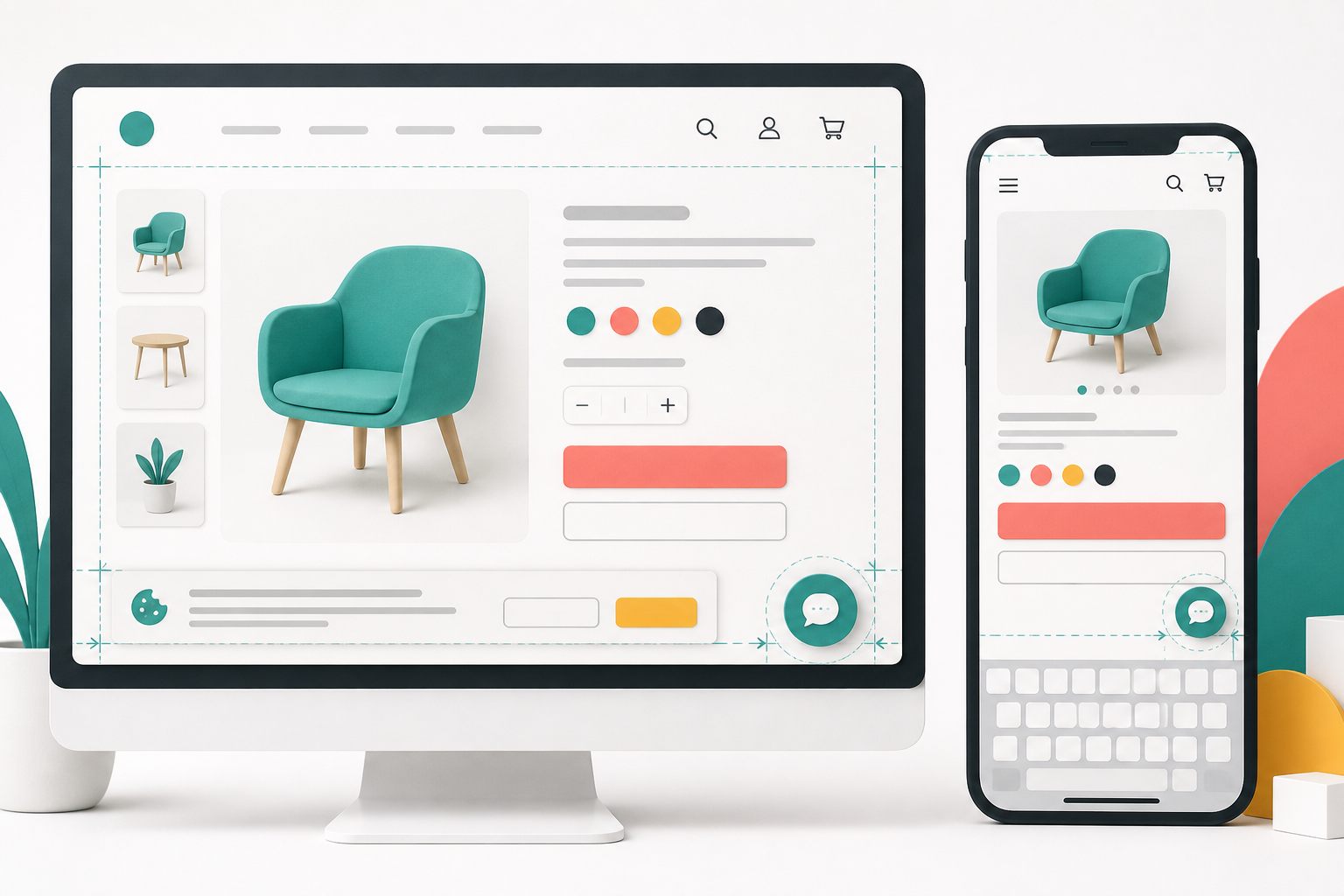
There is no universally safe corner
Many chat launchers begin near the bottom-right of the viewport because people often recognize that location and it usually stays outside the main reading column. That convention is a starting point, not proof that the launcher fits a particular website.
A bottom corner may already contain a cookie banner, accessibility menu, back-to-top control, mobile navigation, sticky purchase button, map control, or another support tool. Two individually reasonable components can become a blocked checkout button or an untappable cluster when they occupy the same layer.
Judge placement by the whole page at each breakpoint. The launcher, open panel, close control, and message field all need room. Test the states visitors actually encounter rather than approving one clean desktop screenshot.
Map every fixed element before choosing live chat widget placement
Open the website template and list anything attached to the viewport instead of the document flow. Check the header, footer, consent notice, mobile menu, sticky cart or booking action, promotional bar, accessibility control, video player, and third-party badges. Repeat the inventory on product, cart, checkout, account, contact, and long article pages because templates often differ.
Record when each element appears. A consent banner may show only on a first visit. A sticky add-to-cart button may appear only after scrolling. A mobile browser toolbar and onscreen keyboard reduce the usable viewport during typing. Placement that looks clear at page load can fail midway through the visit.
Decide which control owns each corner. If two tools must remain, change the surrounding site's fixed controls or remove a redundant control. Do not solve overlap by stacking several small buttons so closely that visitors can easily tap the wrong one.
- Closed chat launcher
- Open chat panel and close control
- Cookie or privacy choices before and after consent
- Sticky cart, booking, call, and navigation controls
- Accessibility and language tools
- Mobile browser chrome and onscreen keyboard
Keep desktop chat close to support intent, not the main action
On a wide page, keep the closed launcher visually available without placing it over the primary call to action. Product configuration, Add to cart, Pay, Submit order, Book, and Save controls should remain unobstructed at normal zoom and after validation messages expand the page.
Open the chat panel and scroll from top to bottom. Look for content hidden behind the panel, especially floating comparison tools, form buttons, table controls, and links at the end of the page. Close and reopen chat after changing browser width because fixed elements can move at breakpoints.
The launcher label should state the current action. Chat works when a person or enabled AI reply mode can answer. Message is more honest when visitors are leaving a request for follow-up. A familiar position cannot repair a misleading expectation.
Treat mobile placement as a separate layout decision
A phone is not a narrow desktop. The browser controls, device safe area, thumb reach, sticky navigation, and keyboard all compete for the bottom of the screen. Test portrait and landscape, then test at the smallest supported width rather than only on a large phone.
First inspect the closed launcher while the page is at the top, midway down, and at the final action. Next open chat, focus the message field, type several lines, and confirm the latest message, send control, and close control remain reachable when the keyboard is visible. Rotate the device and repeat. Also increase browser text size and zoom where the browser permits it.
Use shorter mobile launcher wording when a desktop text label consumes too much space. An icon-only launcher can reduce the footprint, but it still needs an accessible name and a recognizable purpose. Hiding chat on mobile may remove a conflict, but it also removes support; use that option intentionally and provide another contact route.
Protect keyboard focus from overlays
Chat panels and sticky site controls share an accessibility risk: they can cover the control that currently has keyboard focus. WCAG 2.2 Focus Not Obscured (Minimum) says a focused user interface component must not be entirely hidden by author-created content. W3C specifically identifies sticky headers, sticky footers, cookie banners, and persistent chat interfaces as situations that need careful handling.
Test without a mouse. Tab through the page before opening chat, open it from the keyboard, move through every chat control, close it, and continue through the underlying page. The focused control should stay visible and the visitor should have a clear way to dismiss the open panel.
This is a page-level test, not a claim that installing any widget makes a website WCAG conformant. Theme code, other overlays, content order, contrast, focus behavior, and third-party tools all affect the final experience.
Leave enough size and separation for touch
Crowding the chat launcher beside another floating control increases accidental taps. WCAG 2.2 Target Size (Minimum) uses a 24 by 24 CSS pixel target, with defined exceptions that include sufficient spacing. W3C notes that larger targets and adequate separation help people with limited fine motor control and also improve touchscreen use more broadly.
Measure the interactive target, not only the visible icon. Check the launcher against nearby cookie choices, bottom navigation, phone buttons, and sticky commerce actions. Repeat the check after translation because longer labels can change widths and wrapping.
Do not treat the 24-pixel figure as a design goal for an important floating control. It is a minimum criterion with exceptions. A comfortably sized launcher with clear space around it is easier to discover and activate.
Resolve cookie-banner conflicts before launch
Consent tools are a common source of overlap because they may be absent during routine testing after the tester has already made a choice. Use a private window or clear the relevant storage so the first-visit banner appears. Test accept, reject, settings, and close states where provided.
The visitor must be able to read and operate the consent choices without the chat launcher covering them. The launcher also should not become the only obvious control in the corner while a legally or operationally important notice is partly hidden behind it.
Test delayed banners too. Open chat first, wait for the consent or promotion layer to appear, and verify both interfaces remain understandable. If the site cannot keep both usable, prioritize the required page control and alter the site's overlay arrangement.
Test storefront pages at the moment of purchase
On a WooCommerce storefront, inspect product variation selectors, quantity controls, Add to cart, the mini-cart, coupon fields, checkout navigation, payment choices, Place order, account forms, and order confirmation. Also trigger validation errors so you can see where controls move after the page reports missing or invalid information.
Support can be valuable during a purchase, but the chat panel should not become another checkout obstacle. Close it before entering sensitive payment data, and never ask visitors to place passwords, one-time codes, full payment-card numbers, or card security codes in chat.
Yapdesk works as a chat widget on WooCommerce storefront pages; this guide does not claim a direct WooCommerce integration. Any order lookup, refund, or account action still belongs in the business's authorized systems and process.
Sources: Yapdesk guide: WooCommerce live chat · Yapdesk guide: Returns and refunds conversations
Use the Yapdesk controls that actually exist
Yapdesk core human live chat and message mode are free with Yapdesk branding. In Chat Settings, you can edit the widget title, primary color, desktop launcher label, launcher style, launcher icon, send-button text, and message-mode copy. You can also choose whether the widget appears on mobile and set a separate mobile text or icon style with shorter mobile labels.
Use Live Widget Preview while editing, save the settings, and then test the public website. The preview helps with copy and appearance, but it cannot reveal conflicts created by the site's cookie tool, theme, checkout controls, or browser viewport.
The current settings described here do not include a left-or-right placement control. If the launcher's fixed location conflicts with a critical site control, adjust the surrounding site's fixed elements, reconsider which tools need to float, or hide the widget on mobile only when another support route remains clear.
AI Only and Hybrid AI + Agent are Pro AI features. Placement testing is required whether replies come from a human agent, message mode, or an enabled Pro AI workflow.
Run a repeatable placement test before every major site change
Create a short test matrix for the templates and devices that matter to the business. Run it after changing the theme, consent platform, mobile navigation, checkout extension, page builder, accessibility tool, or Yapdesk launcher settings. A placement decision can become stale when another fixed component changes.
Use a real phone in addition to responsive browser tools. Capture failures with the page URL, viewport or device, browser, chat state, consent state, and a screenshot. That evidence makes an overlap problem reproducible instead of a vague report that chat sometimes gets in the way.
- Load each key template as a first-time visitor and inspect every fixed control.
- Check the closed launcher at the top, middle, and bottom of the page.
- Open chat and confirm important page actions remain visible and operable.
- Use only the keyboard on desktop and verify focused controls do not disappear behind overlays.
- On a real phone, type a multi-line message with the keyboard open and rotate the device.
- Trigger form and checkout errors, consent settings, sticky bars, and delayed notices.
- Repeat with increased text size, zoom, and the languages the website supports.
- Record the result and retest after any component that attaches to the viewport changes.
Start with free live chat
Add Yapdesk to WordPress, answer visitors from one inbox, and use message mode when your team is away. Pro AI is available when you want an AI assistant trained on your business.